Introduction
Images are among the most effective ways to communicate visual changes, demonstrate improvements, and present information on a website. Businesses, photographers, designers, construction companies, digital agencies, and service providers frequently need to show visitors how something looked before a particular change and how it looks afterward.
Displaying two images side by side is one way to achieve this, but it does not always communicate the differences effectively. A before-and-after image slider provides a more interactive solution by allowing visitors to drag a divider across an image and reveal two different versions of the same scene.
For example, a photographer can use a before-and-after slider to demonstrate photo editing results. A web development company can show an old website design alongside its redesigned version. Similarly, a renovation business can demonstrate improvements to a property by allowing visitors to compare the original and completed results.
WordPress makes it possible to add this functionality through dedicated plugins, Gutenberg blocks, page builders, or custom HTML, CSS, and JavaScript.
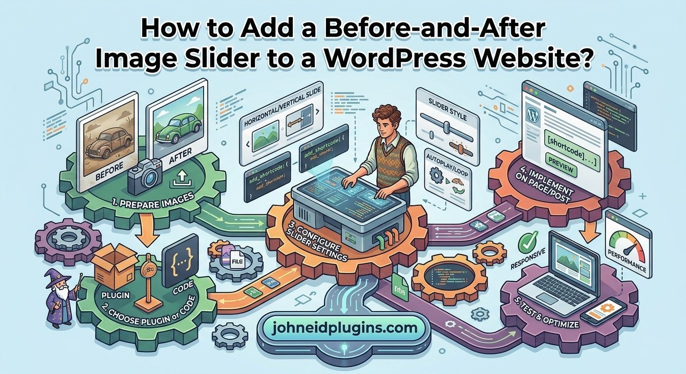
In this comprehensive guide, you will learn how to add a before-and-after image slider to a WordPress website using different approaches. We will also cover image preparation, responsive design, accessibility, performance optimization, troubleshooting, and development best practices.
Whether you are a beginner managing a business website or a WordPress developer building custom functionality, this tutorial will help you implement an effective image comparison slider.
What Is a Before-and-After Image Slider?
A before-and-after image slider is an interactive website component that displays two images in the same viewing area.
One image represents the original condition, while the other represents the modified or updated condition. A movable divider allows visitors to reveal more or less of either image.
Unlike a traditional image gallery, this component overlays two images and provides an interactive comparison experience.
For example:
- Photography: Compare an original photograph with an edited version.
- Web development: Demonstrate an old website design and its redesigned version.
- Construction: Show a property before and after renovation.
- Interior design: Compare an empty room with its furnished appearance.
- Automotive: Demonstrate vehicle restoration results.
- Landscaping: Display outdoor spaces before and after improvements.
- Graphic design: Compare original artwork with a redesigned version.
A typical before-and-after image slider includes the following elements:
- An original image.
- A modified image.
- A movable vertical or horizontal divider.
- A draggable handle.
- Before and After labels.
- Responsive dimensions for different devices.
The visitor can move the divider using a mouse, touchscreen, or keyboard, depending on the implementation.
Why Should You Add a Before-and-After Image Slider to WordPress?
Adding an interactive image comparison component can improve the way your website communicates results.
Here are some important advantages.
1. Demonstrate Results Visually
Visitors can immediately understand the difference between two images without opening separate image files.
This is particularly useful for businesses that sell services involving visible improvements.
2. Improve Visitor Engagement
An interactive slider encourages visitors to participate rather than simply looking at static images.
Visitors can move the comparison handle to explore different sections of the images.
3. Build Customer Confidence
Before-and-after comparisons can help demonstrate the results of completed projects.
For example, a web development company can display an original website and its redesigned version to demonstrate its design capabilities.
Use genuine, accurately represented results rather than misleading or manipulated comparisons.
4. Save Website Space
Two separate images displayed at full size can occupy considerable vertical space.
A comparison slider combines them into one interactive component, making it easier to present visual information within a smaller area.
5. Improve Portfolio Presentation
Photographers, designers, architects, and digital agencies can use image comparison sliders to create more engaging portfolios.
Instead of displaying several screenshots, they can allow visitors to interact with a single comparison.
Requirements Before Adding an Image Comparison Slider
Before implementing the functionality, prepare the images and decide how the comparison should appear.
1. Select Two Appropriate Images
Choose an original image and its corresponding modified version.
Both images should represent the same subject, scene, or location.
For example, when comparing a website redesign, use screenshots of the same webpage before and after the redesign.
2. Use Consistent Image Dimensions
Image alignment is essential.
If the two images have different dimensions or aspect ratios, the comparison may look distorted or misaligned.
Whenever possible, use images with identical:
- Width.
- Height.
- Aspect ratio.
- Subject positioning.
- Camera angle.
- Cropping.
This is especially important for photography and property renovation comparisons.
3. Optimize Image Files
Large images can negatively affect website performance.
Compress images before uploading them to WordPress.
Consider using WebP for optimized raster images and appropriate JPEG or PNG formats when necessary.
4. Decide the Slider Orientation
Most before-and-after sliders support two orientations:
- Horizontal comparison: A vertical divider moves from left to right.
- Vertical comparison: A horizontal divider moves from top to bottom.
Choose the orientation that best suits your images and page layout.
Method 1: Add a Before-and-After Image Slider Using a WordPress Plugin
Recommended for beginners
Using a dedicated WordPress plugin is generally the easiest way to create an interactive image comparison slider without writing code.
Several plugins are available through the official WordPress Plugin Directory.
When selecting a plugin, consider its responsiveness, maintenance history, compatibility, accessibility, and available customization options.
Some options worth investigating include:
- Beforely – Before After Image Slider
- Image Split – Before/After Image Comparison Slider
- TwentyTwenty Compare
- WP Before After Image Slider
These plugins provide different combinations of Gutenberg integration, shortcodes, image comparison controls, and customization features. Check their current documentation and requirements before installation.
Step 1: Open the WordPress Administration Dashboard
Log in to your WordPress website.
Navigate to:
Plugins → Add New Plugin
You will see the plugin search interface.
Step 2: Search for a Before-and-After Slider Plugin
Enter a search phrase such as:
Before After Image Slider
Review the available plugins.
Before installing a plugin, check:
- Last updated date.
- Compatibility information.
- Active installations.
- User ratings and reviews.
- Support activity.
- Available documentation.
- Whether the required features are included in the free version.
Avoid installing multiple plugins that provide the same functionality because their JavaScript and CSS files may conflict.
Step 3: Install and Activate the Plugin
After selecting a suitable plugin:
- Click Install Now.
- Wait for the installation to complete.
- Click Activate.
- Locate the plugin’s menu or available Gutenberg block.
The exact administration menu depends on the plugin.
Step 4: Upload the Before and After Images
Open the plugin’s slider creation interface.
Select the original image and the modified image from your WordPress Media Library.
For example:
| Setting | Example |
|---|---|
| Before image | Original website screenshot |
| After image | Redesigned website screenshot |
| Before label | Before |
| After label | After |
| Orientation | Horizontal |
| Initial position | 50% |
| Divider color | White |
The exact settings available depend on the selected plugin.
Step 5: Customize Slider Appearance
Most dedicated comparison plugins provide options for customizing the slider.
Depending on the plugin, you may be able to configure:
- Divider thickness.
- Handle size.
- Handle color.
- Label text.
- Label background.
- Initial divider position.
- Horizontal or vertical orientation.
- Image dimensions.
- Border radius.
- Mouse and touch behavior.
Choose a design that matches your website’s existing color scheme.
Step 6: Publish the Image Comparison
Save the slider configuration.
Some plugins generate a shortcode, while others provide a dedicated Gutenberg block.
If the plugin provides a shortcode, copy it.
Open the WordPress page where you want to display the comparison.
Add a Shortcode block and paste the generated shortcode.
Update the page and open the frontend to test the result.
Method 2: Add a Before-and-After Slider Using Gutenberg
WordPress Gutenberg allows users to build website layouts using individual content blocks.
Some comparison plugins provide dedicated Gutenberg blocks, allowing you to create an image slider directly inside the WordPress editor.
Step 1: Open the Page Editor
Navigate to:
Pages → All Pages
Select the page where you want to display the comparison.
Click Edit to open the Gutenberg editor.
Step 2: Insert the Comparison Block
Click the Add Block (+) button.
Search for the name of your installed comparison plugin.
For example, plugins such as Image Split and TwentyTwenty Compare provide Gutenberg integration.
Select the appropriate block.
Step 3: Select the Before and After Images
Use the image selection controls to choose the two images.
You can upload new images or select existing files from the Media Library.
Make sure both images represent the same scene or subject.
Step 4: Configure Block Settings
Depending on the selected plugin, you may find settings for:
- Comparison orientation.
- Divider position.
- Before and After labels.
- Handle appearance.
- Image dimensions.
- Interaction behavior.
Adjust these settings using the block sidebar.
Step 5: Preview and Publish
Use the editor’s preview functionality to check the comparison.
Test the published page on desktop and mobile devices.
Make sure the divider moves smoothly and the images remain correctly aligned.
Method 3: Add a Before-and-After Slider Using a Page Builder
If your website uses Elementor, Divi, or another page builder, you can use its available comparison widget or an extension that provides this functionality.
The exact procedure depends on your page builder and installed extensions.
Using Elementor
Follow these steps:
- Open the required page using Elementor.
- Search for a before-and-after comparison widget.
- Drag the widget into your desired section.
- Select the original image.
- Select the modified image.
- Configure the divider position.
- Customize the labels and handle.
- Adjust responsive settings.
- Update the page.
If your current Elementor installation does not provide the required widget, you may need a compatible third-party extension or shortcode-based plugin.
Using Divi
If you use Divi, check the available modules and compatible extensions.
A shortcode-based comparison plugin can also be used through a Code or Text module, depending on the plugin’s documentation.
After inserting the comparison, adjust its width, spacing, and alignment.
Important Page Builder Considerations
Page builders can introduce additional CSS and JavaScript.
To avoid compatibility problems:
- Use one comparison solution.
- Avoid loading multiple slider libraries.
- Check the frontend rather than relying only on the editor preview.
- Test responsive breakpoints.
- Verify that the comparison works after caching and optimization.
Method 4: Create a Custom Before-and-After Image Slider Using HTML, CSS, and JavaScript
Recommended for developers
If you want complete control over the appearance and functionality, you can develop your own before-and-after image slider using HTML, CSS, and JavaScript.
This approach is useful when you want to avoid installing an additional WordPress plugin or need a comparison component tailored to your website.
The following implementation creates a basic interactive horizontal image comparison slider.
Step 1: Create the HTML Structure
First, create the HTML structure containing the two images and a range input.
The range input will control how much of the modified image is visible.
<div class="custom-before-after">

    <img
        class="comparison-before"
        src="https://example.com/wp-content/uploads/before.jpg"
        alt="Original image before modification"
    >

    <div class="comparison-after">

        <img
            src="https://example.com/wp-content/uploads/after.jpg"
            alt="Modified image after improvement"
        >

    </div>

    <span class="comparison-label before-label">
        Before
    </span>

    <span class="comparison-label after-label">
        After
    </span>

    <input
        type="range"
        class="comparison-range"
        min="0"
        max="100"
        value="50"
        aria-label="Compare before and after images"
        aria-valuetext="50 percent after image visible"
    >

</div>
Replace the example image URLs with the actual URLs of your uploaded WordPress images.
The HTML structure contains:
- The original image as the background layer.
- The modified image inside an overlay container.
- Before and After labels.
- A range input for controlling the comparison position.
Using a native range input also provides keyboard interaction without requiring you to build a custom keyboard control from scratch.
Step 2: Add CSS for the Image Comparison
Next, add CSS to position both images correctly.
.custom-before-after {
    position: relative;
    width: 100%;
    max-width: 900px;
    aspect-ratio: 16 / 9;
    overflow: hidden;
    margin: 20px auto;
    background: #eeeeee;
    --position: 50%;
}

.comparison-before,
.comparison-after img {
    position: absolute;
    inset: 0;
    width: 100%;
    height: 100%;
    object-fit: cover;
}

.comparison-after {
    position: absolute;
    inset: 0;
    width: var(--position);
    overflow: hidden;
    border-right: 3px solid #ffffff;
}

.comparison-after img {
    width: 100%;
    max-width: none;
    object-fit: cover;
}

.comparison-label {
    position: absolute;
    top: 15px;
    padding: 7px 14px;
    color: #ffffff;
    background: rgba(0, 0, 0, 0.7);
    border-radius: 4px;
    font-size: 14px;
    z-index: 2;
}

.before-label {
    left: 15px;
}

.after-label {
    right: 15px;
}

.comparison-range {
    position: absolute;
    inset: 0;
    width: 100%;
    height: 100%;
    margin: 0;
    opacity: 0;
    cursor: ew-resize;
    z-index: 3;
}

.custom-before-after:focus-within {
    outline: 3px solid #2271b1;
    outline-offset: 3px;
}

.custom-before-after::after {
    content: "";
    position: absolute;
    top: 50%;
    left: var(--position);
    width: 42px;
    height: 42px;
    background: #ffffff;
    border: 3px solid #2271b1;
    border-radius: 50%;
    transform: translate(-50%, -50%);
    pointer-events: none;
    z-index: 2;
}

@media (max-width: 600px) {

    .custom-before-after {
        aspect-ratio: 4 / 3;
    }

    .comparison-label {
        top: 10px;
        font-size: 12px;
        padding: 5px 9px;
    }

}
The CSS creates an image comparison container with a fixed aspect ratio.
The overflow: hidden property ensures that the overlay image remains inside the comparison area.
The --position CSS variable controls the visible width of the modified image.
The circular handle provides a visual indication of where the two images meet.
Step 3: Add JavaScript Functionality
Now add JavaScript to connect the range input with the image comparison container.
document.querySelectorAll('.custom-before-after').forEach(function(slider) {

    const range = slider.querySelector('.comparison-range');

    function updateSlider() {

        const value = range.value;

        slider.style.setProperty('--position', value + '%');

        range.setAttribute(
            'aria-valuetext',
            value + ' percent after image visible'
        );

    }

    range.addEventListener('input', updateSlider);

    updateSlider();

});
This JavaScript performs three important tasks:
- Detects changes to the range input.
- Updates the CSS variable controlling the image overlay.
- Updates the accessible description of the slider position.
Because the code uses querySelectorAll(), it can initialize multiple comparison sliders on the same page.
Step 4: Add the Code to WordPress
There are several ways to integrate this implementation into WordPress.
Option A: Gutenberg Custom HTML block
Add the HTML markup using a Custom HTML block.
Place the CSS in:
Appearance → Customize → Additional CSS
Depending on your active theme, Additional CSS may instead be available through the Site Editor under Styles.
Add the JavaScript through a suitable custom code plugin or a properly enqueued JavaScript file.
Option B: Create a custom WordPress plugin
For reusable functionality, create a small custom plugin containing:
- A shortcode for displaying comparisons.
- HTML output for the image layers.
- A stylesheet.
- A JavaScript initialization file.
- Administrative controls for selecting images.
This approach is more maintainable when you need the same feature on multiple pages.
Option C: Use a child theme
If the comparison feature is specific to your website’s design, you can include its stylesheet and JavaScript in a child theme.
Avoid directly modifying the parent theme because theme updates can overwrite your changes.
For additional information, consult the WordPress documentation on including CSS and JavaScript.
Step 5: Test the Custom Slider
After adding the code, open the frontend page.
Check the following:
- Both images appear correctly.
- The divider moves when the range input changes.
- The images remain aligned.
- The labels remain visible.
- The slider fits smaller screens.
- Keyboard users can operate the range input.
Important technical consideration: The example uses object-fit: cover. Both images must have matching proportions and framing for accurate visual comparison. If your images have different dimensions, crop and align them before uploading.
Method 5: Create an Advanced Image Comparison Slider Using a JavaScript Library
If you need advanced functionality, a dedicated JavaScript library can simplify development.
One option is the TwentyTwenty image comparison plugin originally developed for interactive image overlays. You can also investigate other maintained comparison libraries.
A library-based solution can provide features such as:
- Drag-and-drop comparison.
- Touchscreen support.
- Horizontal and vertical orientation.
- Custom divider handles.
- Adjustable starting positions.
- Multiple image comparisons.
- Responsive layouts.
Before choosing a library, check its maintenance status, license, browser compatibility, and accessibility features.
Step 1: Select a Suitable Library
Review the available documentation and examples.
For example, the TwentyTwenty comparison library demonstrates the concept of overlaying two images and revealing them through a draggable divider.
Step 2: Register the Required Assets
If you are integrating a library into a WordPress plugin, register its CSS and JavaScript files using WordPress enqueue functions.
For example:
function my_comparison_slider_assets() {

    wp_enqueue_style(
        'my-comparison-style',
        plugin_dir_url(__FILE__) . 'assets/css/comparison.css',
        array(),
        '1.0.0'
    );

    wp_enqueue_script(
        'my-comparison-script',
        plugin_dir_url(__FILE__) . 'assets/js/comparison.js',
        array(),
        '1.0.0',
        true
    );

}

add_action(
    'wp_enqueue_scripts',
    'my_comparison_slider_assets'
);
This example assumes that the files exist inside your custom plugin directory.
For a third-party library, also register and enqueue its required dependencies in the correct order.
Step 3: Create the Comparison Markup
Follow the selected library’s HTML structure.
Usually, you will need a parent container with two image elements.
Make sure both images have matching dimensions and appropriate alternative text.
Step 4: Initialize the Library
Add the initialization code recommended by the library’s documentation.
If the library requires jQuery, register it as a script dependency rather than loading another copy manually.
Step 5: Configure Responsive Behavior
Adjust the container width and image dimensions using CSS.
Test the implementation on different screen sizes and make sure touch interactions work correctly.
How to Make a Before-and-After Image Slider Responsive
A comparison slider should work smoothly on desktop computers, tablets, and smartphones.
Simply reducing the image width is not always enough. The comparison handle, divider, labels, and image alignment must also adapt to the available space.
1. Use Flexible Container Widths
Avoid unnecessarily fixed-width layouts.
For example:
.comparison-container {
    width: 100%;
    max-width: 1000px;
    margin: 0 auto;
}
This allows the comparison to expand according to the available space while maintaining a maximum width.
2. Use Appropriate Aspect Ratios
An image comparison should preserve its intended proportions.
CSS provides the aspect-ratio property, which helps maintain consistent image dimensions.
For example:
.comparison-container {
    aspect-ratio: 16 / 9;
}
For portrait-oriented comparisons, you might use a different ratio.
3. Adjust Handle Dimensions
A large divider handle may look attractive on desktop computers but consume too much space on smartphones.
Use media queries to adjust its dimensions.
@media (max-width: 600px) {

    .comparison-handle {
        width: 35px;
        height: 35px;
    }

}
4. Support Touch Interactions
Smartphone users should be able to move the comparison divider using their fingers.
Use a comparison solution with proper touch support.
For custom pointer-based implementations, ensure that vertical page scrolling remains possible when the user interacts with a horizontally controlled comparison.
5. Keep Labels Readable
The Before and After labels should remain visible without covering important image details.
Adjust their font sizes, positions, padding, and background colors for smaller screens.
How to Optimize Before-and-After Images for WordPress
Image optimization is particularly important when your comparison slider contains high-resolution photographs or large screenshots.
Follow these recommendations.
1. Compress Both Images
Large images increase page size and can delay loading.
Use image compression tools before uploading files.
Avoid unnecessary image dimensions. If your comparison displays at 900 pixels wide, uploading two extremely large photographs may provide little practical benefit.
2. Use WebP Where Appropriate
WebP is a modern image format that can reduce file size while maintaining good visual quality.
WordPress supports WebP uploads on supported hosting environments.
Read the WordPress image optimization documentation for additional performance guidance.
3. Maintain Image Quality
Do not compress images so aggressively that important visual details disappear.
This is especially important when demonstrating photography edits, architectural improvements, or product changes.
4. Use Proper Alternative Text
Provide descriptive alternative text for meaningful images.
For example:
- Before: Original kitchen before renovation.
- After: Renovated kitchen with modern cabinets.
Remember that a visual comparison should also communicate its purpose to visitors who cannot see the images.
5. Avoid Unnecessary Image Loading
If a page contains several comparison sliders, loading every high-resolution image immediately can increase network usage.
Consider lazy loading below-the-fold comparisons.
However, avoid unnecessarily delaying the primary comparison image when it is visible near the top of the page.
Accessibility Best Practices for Image Comparison Sliders
Accessibility should be considered during development rather than added as an afterthought.
A comparison slider should provide alternative ways to interact with the images.
1. Support Keyboard Navigation
Visitors should be able to operate the divider without using a mouse.
A native HTML range input provides keyboard controls automatically.
For custom sliders, implement appropriate keyboard interactions.
2. Provide Accessible Labels
Use meaningful labels for the comparison control.
For example:
Compare before and after images
Screen readers should be able to identify the control and communicate its current position.
3. Provide Alternative Text
Use appropriate image descriptions.
Avoid relying exclusively on visual labels because screen readers may not communicate the comparison correctly without meaningful image descriptions.
4. Maintain Sufficient Color Contrast
The divider, handle, and labels should be visible against different image backgrounds.
Use contrasting colors and appropriate backgrounds to make controls easier to identify.
5. Avoid Unnecessary Automatic Movement
Automatic animations may distract visitors and make image comparisons difficult to inspect.
A manually controlled slider is often preferable.
For additional guidance, consult the W3C Web Content Accessibility Guidelines and its accessibility recommendations.
Common Problems with WordPress Before-and-After Sliders and Their Solutions
Sometimes, an image comparison slider may not work correctly after installation. The following troubleshooting techniques can help resolve common issues.
Problem 1: Before-and-After Slider Is Not Displaying
Possible causes:
- Incorrect shortcode.
- Plugin activation problems.
- Missing image files.
- JavaScript errors.
- Theme compatibility issues.
Solutions:
- Confirm that the comparison plugin is activated.
- Check whether the shortcode is correct.
- Verify that both image URLs are accessible.
- Clear your WordPress cache.
- Check the browser developer console for JavaScript errors.
- Temporarily test with a compatible theme to identify possible theme conflicts.
Problem 2: Images Are Not Properly Aligned
Possible causes:
- Different image dimensions.
- Different aspect ratios.
- Incorrect cropping.
- CSS conflicts.
Solutions:
Prepare both images with identical dimensions.
Use CSS properties such as object-fit, width, and height to maintain consistent presentation.
If the images show different camera angles or subject positions, adjust them using an image editor before uploading.
Problem 3: Slider Handle Is Not Moving
Possible causes:
- JavaScript initialization failure.
- Missing JavaScript dependencies.
- Incorrect event listeners.
- Conflicting scripts from other plugins.
Solutions:
Open the browser developer console and check for errors.
Verify that the slider’s JavaScript file loads correctly.
If you use a JavaScript optimization plugin, temporarily disable script combination or defer settings to identify whether they interfere with initialization.
Problem 4: Slider Works on Desktop but Not on Mobile
Possible causes:
- Missing touch support.
- Incorrect responsive settings.
- CSS overflow problems.
- Fixed image dimensions.
Solutions:
Choose a comparison plugin that supports touchscreen interactions.
Test the slider on an actual smartphone, not only through desktop browser emulation.
Check whether the handle is large enough to operate comfortably with a finger.
Problem 5: Images Look Blurry
Possible causes:
- Low-resolution source images.
- Excessive image compression.
- Incorrect image resizing.
- Browser scaling.
Solutions:
Upload appropriately sized, high-quality images.
Avoid enlarging small images beyond their original resolution.
Use optimized image formats while preserving sufficient visual quality.
Problem 6: Slider Makes the Website Slow
Possible causes:
- Large image files.
- Multiple comparison libraries.
- Unnecessary JavaScript.
- Excessive animations.
- Unoptimized images.
Solutions:
Compress the images and remove unnecessary scripts.
Load comparison functionality only on pages where it is required.
Use lazy loading for appropriate below-the-fold images.
Test your website with Google PageSpeed Insights to identify performance problems.
Best Practices for Developing a Custom WordPress Image Comparison Plugin
If you are a WordPress developer creating a reusable image comparison solution, consider the following development practices.
1. Follow WordPress Coding Standards
Use WordPress functions and hooks wherever appropriate.
Avoid inserting JavaScript and CSS directly into every page.
Follow the official WordPress Coding Standards when developing the plugin.
2. Provide an Easy Administration Interface
Website administrators should be able to create and manage comparisons without editing source code.
A useful administration interface should include:
- Before image selection.
- After image selection.
- Before and After labels.
- Divider color.
- Handle size.
- Slider orientation.
- Initial divider position.
- Image dimensions.
- Responsive settings.
3. Support Multiple Comparison Sliders
A professional plugin should allow administrators to create multiple independent comparisons.
For example, a construction company might create separate sliders for kitchen renovations, bathroom improvements, and exterior redesigns.
Each comparison should maintain its own images and configuration.
4. Use WordPress Media Library Integration
Integrate the WordPress Media Library instead of requiring administrators to manually enter image URLs.
Using attachment IDs makes image management easier and allows WordPress to provide appropriately sized image variations.
5. Implement Security Measures
If the plugin provides an administration interface, implement appropriate security controls.
These should include:
- Nonce verification for administrative form submissions.
- Capability checks.
- Input validation.
- Data sanitization.
- Output escaping.
For example, use esc_url() for URLs, esc_attr() for HTML attributes, and esc_html() for text output where appropriate.
Refer to the WordPress Plugin Developer Handbook for detailed development guidance.
6. Avoid Unnecessary Dependencies
Do not load multiple JavaScript libraries when one lightweight implementation can provide the required functionality.
Use WordPress enqueue functions and load assets conditionally.
7. Test Theme and Plugin Compatibility
Test the comparison slider with different WordPress themes, page builders, caching plugins, and optimization tools.
Pay particular attention to CSS conflicts and JavaScript initialization problems.
How to Test Your Before-and-After Image Slider
Before publishing the comparison on a production website, perform a complete functionality test.
Use this checklist:
- Both images display correctly.
- Images are properly aligned.
- Original and modified images have appropriate dimensions.
- The divider moves smoothly.
- The slider works with a mouse.
- Touchscreen interaction works.
- Keyboard navigation works.
- Before and After labels are visible.
- The slider works on desktop computers.
- The slider works on tablets.
- The slider works on smartphones.
- Images do not become distorted.
- No horizontal page overflow occurs.
- No JavaScript errors appear.
- Images load without broken links.
- The component does not noticeably affect page performance.
You can also test accessibility using the WAVE Web Accessibility Evaluation Tool.
Frequently Asked Questions (FAQs)
1. How do I add a before-and-after image slider in WordPress?
You can add a before-and-after image slider using a dedicated WordPress plugin, Gutenberg block, page builder, or custom HTML, CSS, and JavaScript.
For beginners, installing a comparison slider plugin is usually the easiest approach.
2. Can I create a before-and-after slider without a WordPress plugin?
Yes. You can develop a custom comparison slider using HTML, CSS, and JavaScript.
A range input can control the visible portion of an overlaid image, allowing visitors to compare two photographs interactively.
3. Which WordPress plugin is best for before-and-after image comparisons?
The best plugin depends on your requirements.
You can investigate Beforely, Image Split, TwentyTwenty Compare, and WP Before After Image Slider.
Compare their current features, accessibility, maintenance, performance, and compatibility before selecting one.
4. Can I add multiple before-and-after sliders to one page?
Yes. Most dedicated comparison plugins support multiple sliders.
Custom implementations can also support multiple independent comparison containers using appropriately scoped JavaScript initialization.
5. Can I use before-and-after sliders on mobile devices?
Yes. Responsive comparison sliders can work on smartphones and tablets.
Choose a solution with touchscreen support and appropriate responsive settings.
6. Do before-and-after sliders affect website speed?
They can affect performance if they load large images or unnecessary JavaScript libraries.
Compress images, use appropriate image dimensions, and load scripts only when required.
7. Can I use a before-and-after slider with Elementor?
Yes. You can use a compatible Elementor comparison widget or insert a shortcode generated by a comparison plugin.
Check the plugin documentation to confirm its Elementor compatibility.
8. Can I change the slider direction?
Many comparison plugins support horizontal and vertical orientations.
The horizontal layout generally uses a vertical divider, while the vertical layout uses a horizontal divider.
9. Can I customize the Before and After labels?
Yes. Many plugins allow you to change label text, colors, backgrounds, positions, and font sizes.
Custom HTML and CSS implementations also provide complete control over label appearance.
10. Are before-and-after image sliders SEO-friendly?
They can be SEO-friendly when implemented properly.
Use meaningful alternative text, descriptive captions, optimized images, and accessible HTML.
Avoid relying exclusively on JavaScript-generated content that search engines or assistive technologies may have difficulty processing.
Conclusion
Adding a before-and-after image slider to a WordPress website is an effective way to demonstrate visual changes, showcase completed projects, and improve the presentation of images.
Whether you are a photographer displaying edited photographs, a construction company presenting renovation results, a designer showcasing creative work, or a web development company demonstrating website redesigns, an interactive comparison slider can make your content more engaging.
WordPress offers several implementation options, including dedicated plugins, Gutenberg blocks, page builders, and custom HTML, CSS, and JavaScript.
For beginners, an established comparison plugin provides a convenient solution without requiring programming knowledge. Developers who need greater flexibility can build a custom implementation or integrate a suitable JavaScript library.
Regardless of your chosen approach, focus on image alignment, responsive layouts, accessibility, performance optimization, and compatibility with different WordPress themes.
A properly developed before-and-after image slider should provide visitors with a smooth and accessible comparison experience while helping your website communicate the value of your work more effectively.